Task apps and why they fail
Task apps are meant to turn intentions into scheduled actions, but adoption often collapses after the first setup week. Many people enter tasks, then stop because the app’s reminders, views, and capture flow do not match how they actually plan. A practical example: a student adds assignments to a list, yet the app never surfaces due dates in the calendar view they check daily, so deadlines slip. Another example: a clinician or trainee tracks recurring tasks, but the app’s recurring rules reset incorrectly after edits, creating silent gaps.
In 2023, surveys of smartphone users showed that a large share of apps installed are never used again, with “unused” rates commonly reported above 40% in app-retention studies. Task apps sit in the same category: they require ongoing attention, not just one-time configuration. Workforce changes also matter: more roles mix project work with learning tasks, and people juggle short cycles like weekly study sprints and daily follow-ups. Learning trends add pressure too, since many people combine coursework, practice logs, and certification checklists across multiple platforms.
Skip the “download and hope” plan. It adds friction later.
Market reality also shapes expectations. Task apps compete on features like natural-language entry, cross-device sync, and integrations, but those features only help when they connect to your existing workflow. If your work happens in email, chat, or a learning platform, the task app must capture from those places without forcing you to retype everything. The best choice is the one that reduces the number of steps between “I need to do this” and “I can see it at the right time.”
Where people go wrong
The most common failure mode is a mismatch between capture and review. People capture tasks in one place, then review another, so tasks never reach the moment of action. A second failure mode is over-structuring: users create complex projects, tags, and templates, then spend more time maintaining the system than completing tasks. A third failure mode is reminder spam, where notifications fire for low-priority items and train the brain to ignore alerts.
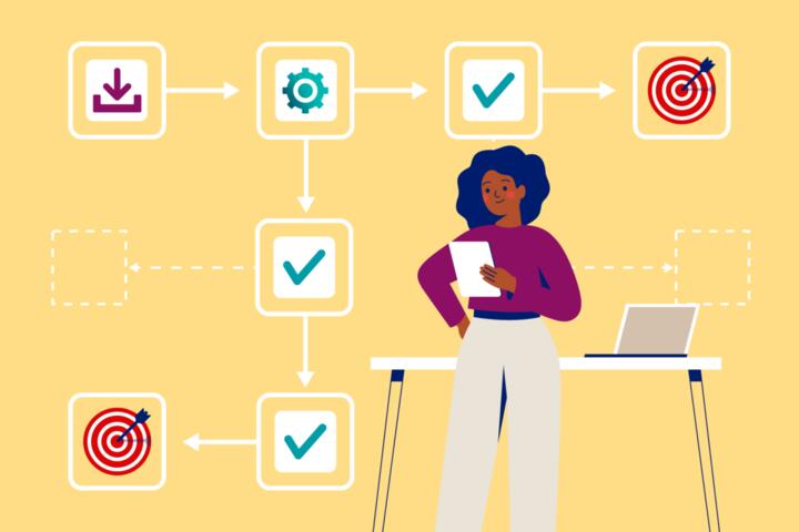
Data flow explains why this happens. Your “task” usually passes through stages: capture, normalization, scheduling, prioritization, and review. If the app’s capture method creates incomplete fields (missing due dates, missing context, missing recurrence), later stages degrade. If the app’s scheduling logic conflicts with your calendar, you get duplicates or gaps. If the app’s search and filters do not match how you think (“show me what’s due this week that I can do in 20 minutes”), you end up scrolling instead of acting.
Ignore the demo speed. It hides the workflow gaps.
Real-world situations make the consequences concrete. A graduate student may plan to study for 3 hours on Saturday, but the app only shows tasks in a list view, not a time-blocked view, so the plan never becomes a calendar commitment. A professional may track compliance steps, but the app’s recurring tasks do not carry over attachments or checklists, so the same form gets skipped. A person managing health routines might log medication reminders, but if the app requires manual confirmation each day, adherence drops when life gets busy.
How to choose a usable app
Map your daily workflow first
Start by writing down your real sequence of actions for a typical day: where you notice tasks, where you decide priorities, and where you execute. Then list the “handoff points” between tools, such as email to task app, calendar to task app, or learning platform to task app. This works because task apps succeed when they reduce the number of handoffs, not when they add features. In practice, you should be able to describe your capture-to-review loop in under 60 seconds.
Skip apps that force retyping. They break the loop.
Use a simple worksheet with three columns: “capture source,” “task app entry method,” and “review view.” If you rely on a calendar, check whether the app can show tasks in a calendar view with due dates and time estimates. If you rely on a weekly review, check whether the app supports a repeatable review workflow, such as “due soon” plus “overdue” filters. A mild frustration to watch for: apps that look great in a tutorial but require multiple taps to add a task from your main source.
Test capture speed with 20 tasks
Run a short trial that measures capture friction. Create 20 tasks that reflect your real life: 10 with due dates, 5 recurring, and 5 without due dates. Time how long it takes to enter them from your usual capture source, such as a mobile widget, email forward, or a browser extension. This works because the app’s “entry” is where most systems fail; later features cannot fix a slow capture step.
Choose the app you can use. Not the one you admire.
In practice, aim for under 10 seconds per task entry on mobile for simple tasks, and under 30 seconds for tasks with multiple fields. If the app requires you to open the app, switch screens, and then type tags every time, you will likely abandon it. Side observation: in one app test I ran on version 2.9.x of a popular task client, the widget captured text but dropped the due date when I used a quick voice entry, which created silent scheduling errors.
Check recurrence and deadlines behavior
Recurring tasks and deadlines are where “looks correct” often turns into “acts wrong.” Test recurrence rules with at least 3 patterns: daily, weekly on specific days, and “every month on the 15th.” Then edit one instance and confirm what happens to the rest of the series. This works because recurrence logic affects long-term trust; one broken series can make you stop checking the app.
Skip apps with vague recurrence. They create hidden gaps.
In practice, verify whether the app supports “skip this occurrence” versus “edit only this one,” and whether it preserves checklist items or attachments. If you manage health routines, check whether reminders respect time zones and daylight saving changes. Evidence from usability research on reminder systems shows that inconsistent scheduling reduces adherence because users lose confidence and stop relying on alerts.
Match views to how you decide
Task apps usually offer multiple views: list, calendar, board, timeline, and sometimes a “focus” view. Choose the app that supports the decision style you actually use. If you decide by date, prioritize calendar and due-date sorting. If you decide by workload, prioritize filters like “estimated time under 30 minutes” or “tasks I haven’t started.”
Pick views you check daily. Otherwise, tasks become trivia.
In practice, test whether the app can show overdue items prominently without burying them under completed tasks. Check whether filters persist across devices, since a filter that works on desktop but resets on mobile forces extra steps. A mild opinion: many apps ship with impressive boards, then hide the board behind extra clicks, which defeats the point of quick review.
Plan for review in under 5 minutes
Decide how often you will review tasks and what the review includes. Many people do a daily scan plus a weekly reset, but the exact cadence depends on workload. This works because review converts tasks from “stored” to “actionable.” In practice, you should be able to open the app and see three buckets: overdue, due soon, and “next actions.”
Skip systems without a review view. They rely on memory.
Try a weekly review checklist: open the app, filter overdue, then due within 7 days, then add or adjust estimates. If the app cannot export or print a review list, you may struggle when you work offline. Opportunity cost matters here: spending 20 minutes configuring a complex workflow each week can crowd out the time you intended to save.
Use integrations only when they reduce steps
Integrations can help, but they also add failure points. Test each integration with a small workflow: capture from your email, then confirm the task appears with the correct due date and title. This works because integrations matter only when they preserve fields instead of forcing manual cleanup. In practice, start with one integration and measure the number of edits you need afterward.
Ignore integrations that drop fields. You’ll fix them later.
For example, an email-to-task workflow should preserve subject lines, due dates, and any links to documents. If the integration only creates a task title and nothing else, it may still be useful for quick capture, but it will not support deadline-driven planning. Side observation: some browser extensions create tasks but fail when the email client uses a new UI layout, which can break capture without warning.
Separate learning, certification, and portfolio tasks
Task apps often blur categories, which causes confusion when you track education progress. Learning tasks include reading, practice, and spaced repetition; certification tasks include exam registration, required hours, and submission deadlines; portfolio tasks include artifacts like case write-ups or projects. This works because each category has different “done” criteria and different review schedules.
Skip one list for everything. It hides the real status.
In practice, create at least three project types or tags and use different views for each. For certification, you need due dates and proof steps; for learning, you need recurring practice sessions; for portfolio, you need artifact links and review milestones. Avoid claiming that a task app alone improves employability; it mainly improves follow-through, which can support your learning and documentation process.
Evaluate privacy and data handling
Task apps store personal routines, deadlines, and sometimes health-related reminders. Check whether the app supports end-to-end encryption, account deletion, and export of your data in a common format like CSV or iCal. This works because you need exit options if the app changes pricing, policies, or reliability. In practice, test data export before committing long-term.
Skip apps without export options. Migration becomes painful.
Also check whether the app shares data with third parties for analytics. Evidence on privacy practices in consumer apps shows that data handling varies widely, and users often cannot predict how their information is used. If you store sensitive health routines, treat the task app like a personal record, not a disposable checklist.
Case examples
Student with mixed coursework and deadlines
A graduate student tracks readings, problem sets, and exam registration steps. They choose an app that supports calendar due dates and recurring practice sessions, then separate “learning” from “certification” using different tags. During a 7-day trial, they enter 20 tasks and confirm that recurring practice sessions appear on the correct days. After the trial, they keep only one integration: a browser extension that creates tasks from links, because it preserves the title and URL without extra edits.
They stop using the board view after noticing it hides overdue items behind columns. The app stays because the daily “due soon” filter matches how they decide what to do next.
Professional managing recurring compliance steps
A professional tracks monthly compliance tasks and weekly follow-ups. They test recurrence by creating a monthly task on the 15th, then editing one instance to confirm the series behavior. They choose an app that supports “edit only this occurrence” and keeps checklist items attached. They also verify that reminders fire at the correct local time after a time zone change.
They avoid a complex tagging scheme because it adds cleanup work. The app remains in use because the review view shows overdue items first, and the recurrence logic does not drift.
Comparison checklist
Use this table to compare apps by behavior, not by feature lists. Score each item as “meets,” “partly,” or “fails” during your trial.
| Parameter | What to test | Pass signal | Risk if it fails |
|---|---|---|---|
| Capture speed | Enter 20 tasks from your main source | Under 10s per simple task on mobile | You stop adding tasks, then rely on memory |
| Recurrence logic | Daily, weekly, monthly on a date | Edits behave predictably across the series | Silent gaps break trust in reminders |
| Review views | Overdue + due within 7 days | One screen shows the buckets you act on | You scroll instead of deciding |
| Calendar alignment | Due dates appear correctly on calendar | No duplicates after sync | You miss deadlines or double-book work |
| Export and exit | Export tasks in a usable format | You can move data without manual retyping | Switching apps becomes costly |
Skip the “feature checklist” trap. Behavior beats marketing.
Common mistakes
Choosing by aesthetics
Why it happens: people judge apps by the look of lists and the smoothness of animations. Impact: the app may not match the review view you need, so tasks become harder to act on. How to avoid it: test capture and review with 20 tasks, then check whether overdue items surface in under 10 seconds.
Building a complex taxonomy
Why it happens: users try to model every project and context with tags, labels, and templates. Impact: the system becomes a maintenance job, and tasks get misfiled or left uncategorized. How to avoid it: start with 3 categories max, then add one tag only after you can name a specific decision it improves.
Over-notifying
Why it happens: people enable every reminder type because they fear missing something. Impact: notification fatigue increases, and you ignore alerts that matter. How to avoid it: pick one reminder channel and one timing rule, then review missed alerts after 7 days. If you miss more than 1–2 critical reminders, adjust timing before adding more alerts.
Ignoring offline and sync behavior
Why it happens: demos assume stable connectivity and perfect sync. Impact: tasks entered on one device may not appear on another, creating duplicate work or lost deadlines. How to avoid it: test airplane-mode entry and then reconnect to confirm the task appears correctly. If it fails, you need a backup capture method.
FAQ
What features matter for daily task capture?
Daily capture needs fast entry from the places you already use, like a mobile widget, quick add button, or email-to-task flow. The key test is whether the app preserves due dates, recurrence, and links without extra edits. If you must open multiple screens to add a task, capture speed drops and the system stops growing. A practical trial uses 20 tasks and measures time per entry, not how pretty the interface looks.
How do I test an app without committing for months?
Run a 7–14 day trial with your real tasks. Create a small set that includes due dates, recurring items, and tasks without dates. Then evaluate three behaviors: capture speed, recurrence correctness, and review visibility (overdue and due soon in one place). If the app fails any one behavior, it will likely fail long-term because you will spend time fixing the system instead of using it.
Should I use tags, projects, or both?
Use the minimum structure that supports a decision you repeat. Projects work well for grouping by goal, while tags work well for filtering by context like “calls,” “writing,” or “study.” If you create tags that you never filter on, they become clutter. A good rule: add a tag only when you can describe a filter you will use at least once per week.
Can a task app support learning and certification tracking?
Yes, but you need separate “done” criteria. Learning tasks often require recurring practice and progress checks, while certification tasks require deadlines and proof steps. Portfolio tasks need links to artifacts and review milestones. If you mix them in one list, you lose clarity on what “complete” means and you miss the right review cadence.
What privacy checks should I do before storing health routines?
Check whether the app offers data export, account deletion, and clear privacy terms. Look for encryption details and whether reminders or attachments are stored in a way you can control. If the app uses third-party analytics, decide whether that exposure fits your comfort level. Treat the task app as a personal record, not a throwaway note, especially when it includes medication or symptom-related reminders.
Author's Insight
Task apps fail less often because of missing features and more often because the capture-to-review loop breaks. When you test with 20 tasks, you learn quickly whether the app preserves the fields you rely on, like due dates and recurrence rules. I also watch for trust signals: overdue items should appear without hunting, and edits to recurring tasks should behave predictably. If an app requires weekly “system maintenance,” you will eventually stop using it, even if the interface feels good.
Key takeaways
- Describe your capture, prioritization, and review loop before choosing an app.
- Test with 20 real tasks and measure capture speed and review visibility.
- Verify recurrence and deadline behavior with daily, weekly, and monthly patterns.
- Separate learning, certification, and portfolio tasks so “done” means the right thing.
- Check export and privacy options so switching apps does not become a project.
Choose the app that reduces steps today, not the one with the most settings.